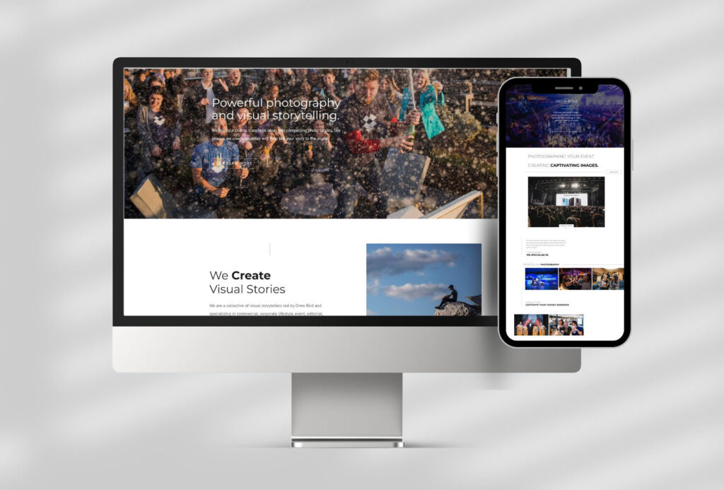
Top 5 must haves on your website homepage
Viewers typically give a website 5-10 seconds before making a decision on whether to leave or stay and explore further. Expect that during this 5-10 seconds your potential client has 10+ tabs open, texts dinging, and the dog barking too.
You have to get their attention and give them the information they want quickly.

Here’s a quick run down of the absolute must haves for the homepage of your website.
Top 5 things to include on your website
Brand Statement
This is one line summarizing what you do. Getting attention is good but the most important aspect is to be clear and concise.
Call to Action
You should include a direct action that you want viewers to take. This can be to sign up for an email list, schedule a phone call, or connect in another way. This spot is for your ideal goal and should be repeated more than once on your homepage.
Secondary Call to Action
Just like it sounds, it’s another option, for those that are not quite ready to make the commitment of directly talking to you yet, or whatever your goal above. It could be to follow you on social, or to signup for a free download.
Your Business Story
This section should demonstrate how you can help your potential clients. If you can do so with a story, that makes it more powerful.
Contact Details
I know this one sounds a little bit silly, but I see a lot of websites that make it difficult to find this information. Depending on what you do, putting your phone number may or may not be necessary, but you need to give easy ways to reach you that are very visible on your homepage and throughout your website. If you’re a busy that caters to local clients, listing your town or general location, is important.
If you want more details, grab a free copy of the guide I wrote, to learn how to create a strategic website homepage that keeps your potential client engaged.
Interested in talking about a website design project? Book a consult.


