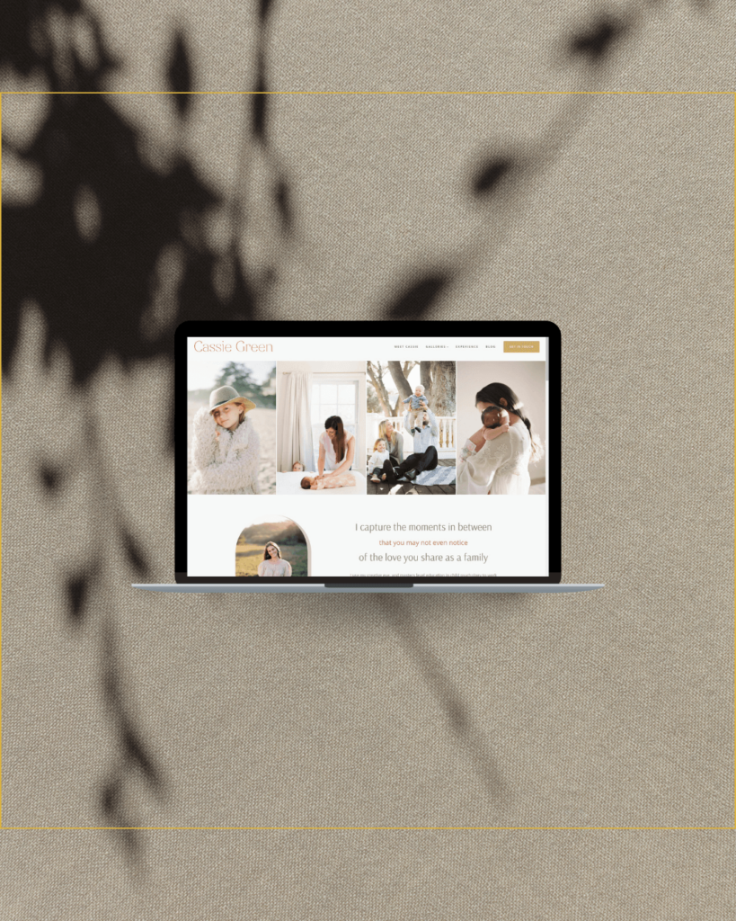
How to choose the best portfolio images for your photography website
You spent days researching and talking to web designers for photographers, or maybe you’re designing the website yourself and put the time into looking at templates. Either you’ve found the perfect SquareSpace or Pro Photo template, or chosen a designer you love. You’re ready for your new site.
It’s your slow time of year, so you sit down at your computer, thrilled to have finished editing all those fall weddings and family portrait sessions. It’s time to make decisions about your website, thinking about your ideal client, and working through how you want to portray your business.

Then you look at your portfolio. It hasn’t been updated in 3+ years. The photography displayed no longer represents the work you do. It all needs to be replaced.
You look at your Lightroom catalog. It has 10,000+ images just from this last season.
You pause.
You breathe.
You decide to go for coffee, or take a yoga class, or pretty much anything that gets you away from the computer.
Two weeks go by before you finally sit back at your computer needing to get this website launched.
It’s a daunting process to choose your best work. Here is what we ask each of our photographers to gather before we start designing a website.
- 10-20 highlight photos to use throughout the website
- 20-30 photos in each category of photography (or if we are doing story-style galleries from each wedding or family)
Besides it being a lot of work to figure out which images to choose, it’s also sometimes difficult to know your own best work. I struggle with designing my own website, because I’m too close to it. I think it’s the same for my clients.

step one
Choose what type of photography portfolios you will show
Think about what types of clients you want and break down your photography into categories.
Ideally each gallery would have a maximum of 30 photos, so be sure to separate types of work. This may include newborns, families, and children for a family photographer. A commercial photographer may have commercial branding, headshots, and corporate events.
If storytelling is essential to your style, consider galleries showing one event or session.
This particularly works well for wedding photographers and personal branding photography. The galleries then show each story, and can be titled by event location or style. For weddings this might be “Hay Adams wedding in Washington DC” or “Virginia rustic vineyard wedding”. With personal branding, it might be “Personal branding session for NYC hair salon”. This lets viewers quickly see what type of photography they want to see (and can also give you an SEO boost).

step two
Narrow down your images by going with your instinct and not being concerned with how many photos (yet)
Grab a cup of coffee, find a quiet space away from your kids (and cat, if yours climbs on your desk like mine). Give yourself a set amount of time, maybe 1-3 hours.
Be ruthless and honest with yourself but truly don’t think for too long. If you’re using Lightroom, you can flag by color for yes, no and maybe categories. Use whatever system you’d use to edit for a photography client.
Work one category at a time. Start with newborns or a specific wedding, whatever strategy you decided above.
Go quickly and put together a folder of your favorites.
Watch out for your emotional attachment to the backstory.
I often have photographers tell me they want to use a different photo on their home page. I’ll ask why they like that particular image. Over and over again, the answer is something behind the scenes.
She was the nicest bride ever.
The family is my old neighbor.
The funniest thing happened before I took the photo.
I’m an art school graduate. I spent two years studying photography at the School of Visual Arts in NYC, then transferred to get a bachelor’s degree in Fine Arts from the State University of NY. Later I went back to school for a certificate in Multimedia Design. I’ve sat through a lot of critiques. Some of these would be 2-3 hours (thank goodness for coffee!) of discussing the artist’s intention, the storytelling behind a photo, and so on.
What it always came down to was that if the photo didn’t capture the viewers attention in some way or cause a stirring of emotion, then nothing else matters. The same applies when we are talking about what images to use in marketing.

step three
Make your final selections
Narrow your photos down to 10-30 per portfolio. Choose images that will stop the scroll.
Think about who your audience is and think about if your audience will relate to these photos. If you’re ideal client would never have long nails painted red, don’t show an engagement photo with a close up of the ring with this style polish.
Make sure it is the type of work you want to be doing. If you don’t like photographing backyard weddings, show the type of work you enjoy.
Once you have the portfolios put together, walk away.
Take an hour, take two days, whatever you need to look at it with a fresh eye. Then do one final review.
If you can’t get through this step, consider asking a friend who is similar to your target client to review the portfolio, or asking a photographer friend to trade a couple of hours to review each others work. Also, some established photographers offer portfolio reviews as part of their services, and we offer portfolio selection as an add-on to our website design packages.
If you have questions, always feel free to send me a note.


