Vickie Gray’s new look
We created a custom website for Vickie Gray Photography using Pro Photo 7. Vickie is based in an urban area of Baltimore and loves the diversity. She’s very involved in her community and spends time volunteering her photography skills. She also travels to Cuba regularly to photograph.
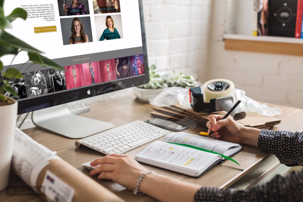
When we talked about her website, she wanted to have all these elements that differentiate her highlighted throughout the site. It was also important to her business that the site be bold and have clear calls to action, making it easy for clients to contact her or book online.
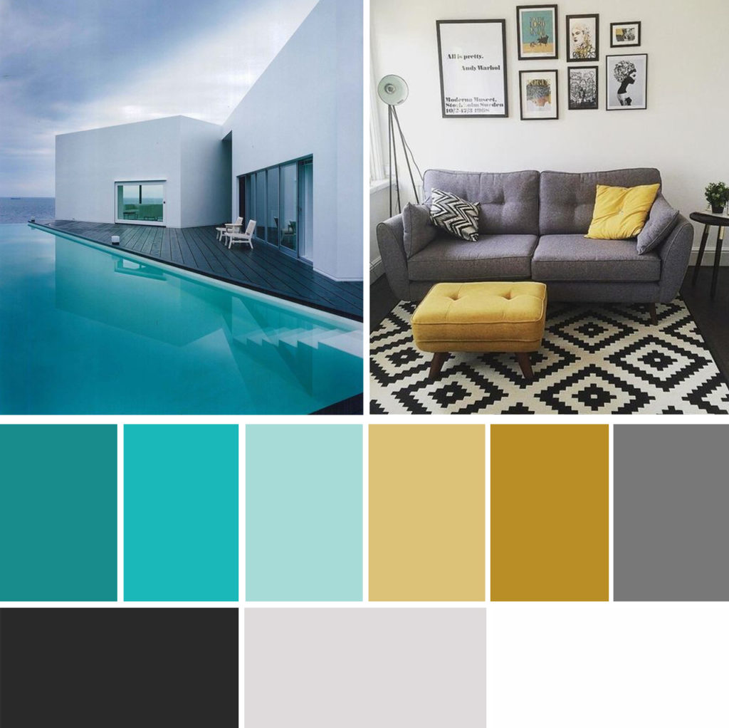
We created a bright powerful color palette. This palette is one that I almost didn’t want to share. I love teals, gray and yellows, and sort of wanted it for my own brand revamp… but it was perfect for Vickie.
Below is our concept homepage mockup. This is done in Photoshop during phase 1 of our custom website design projects. It’s always interesting for me to look back and see how the site has changed from initial concept. There are certain things I want to make sure we agree about in the early phases but other parts are fine to be fluid. Mainly I need to know that we are all on the same page when it comes to the feel and vibe of the brand.
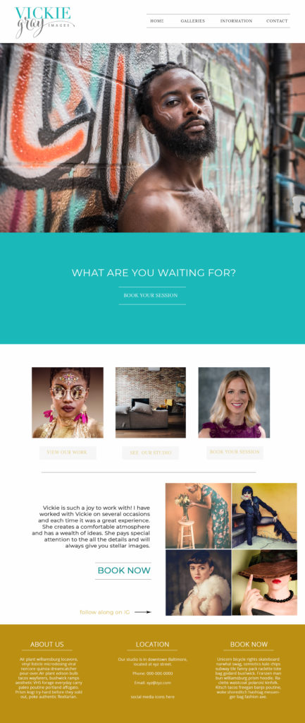
After playing with this design a bit, Vickie felt it needed to be a bit more corporate and urban of a feel, so you’ll see on the final site we added more grays, and used the brights as color pops. We also changed from having a large header to a carousel style slideshow.
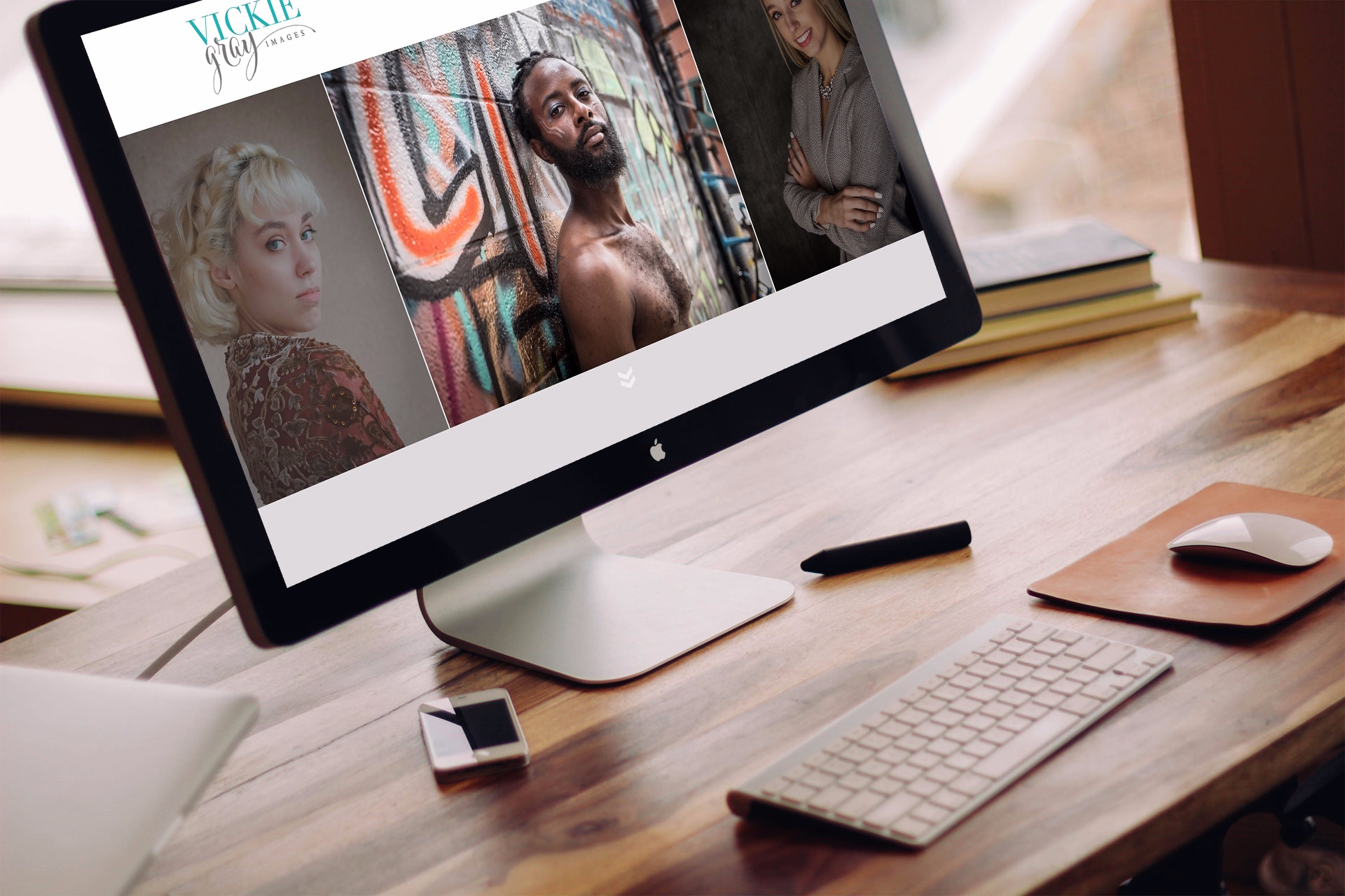
You can visit Vicki’s site at https://vickiegrayimages.com
If you are looking for a new website, please send me a note. We are accepting new custom design clients for April 2019.

