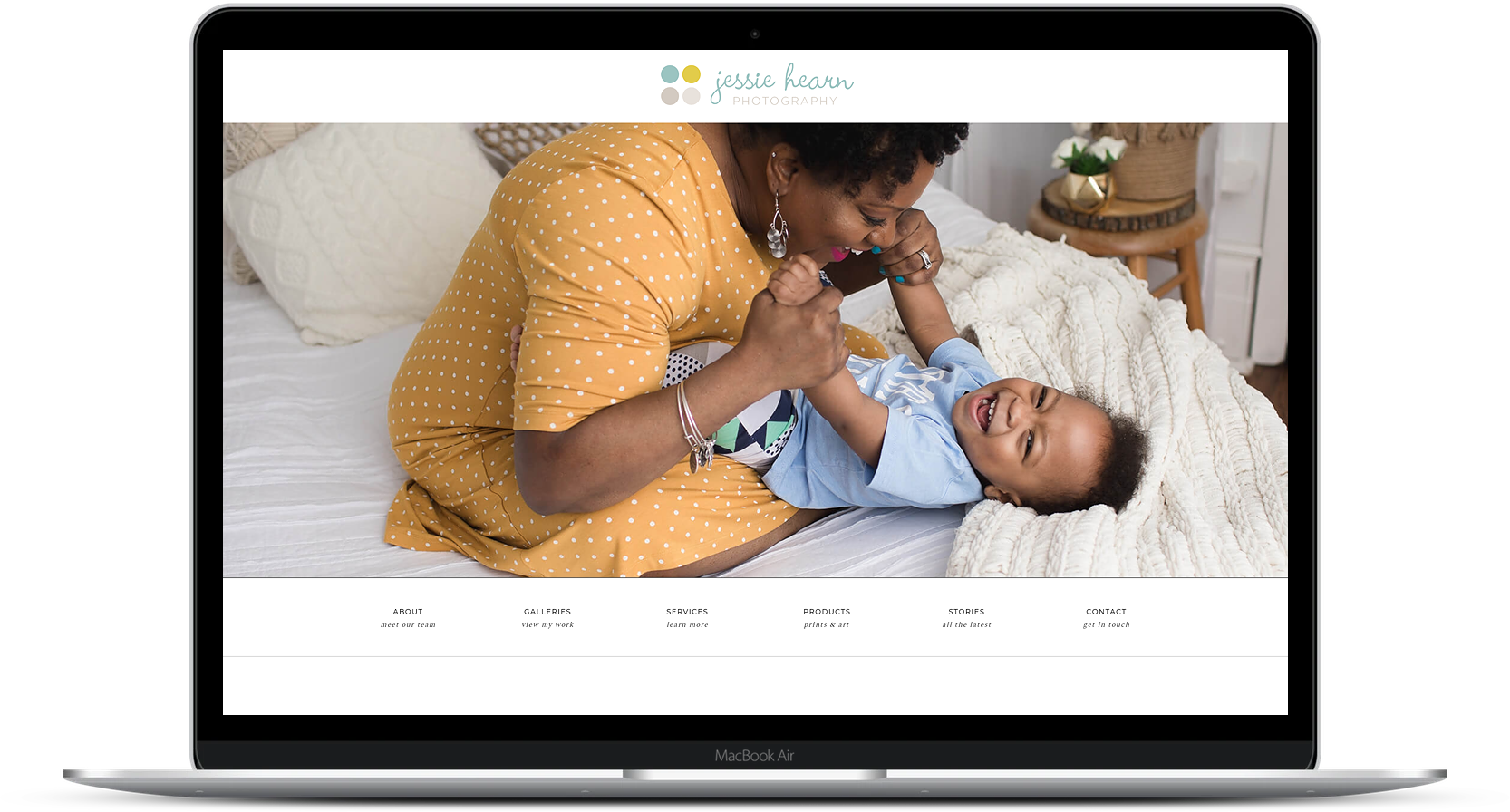
We just launched this new Pro Photo website for a family portrait photographer!
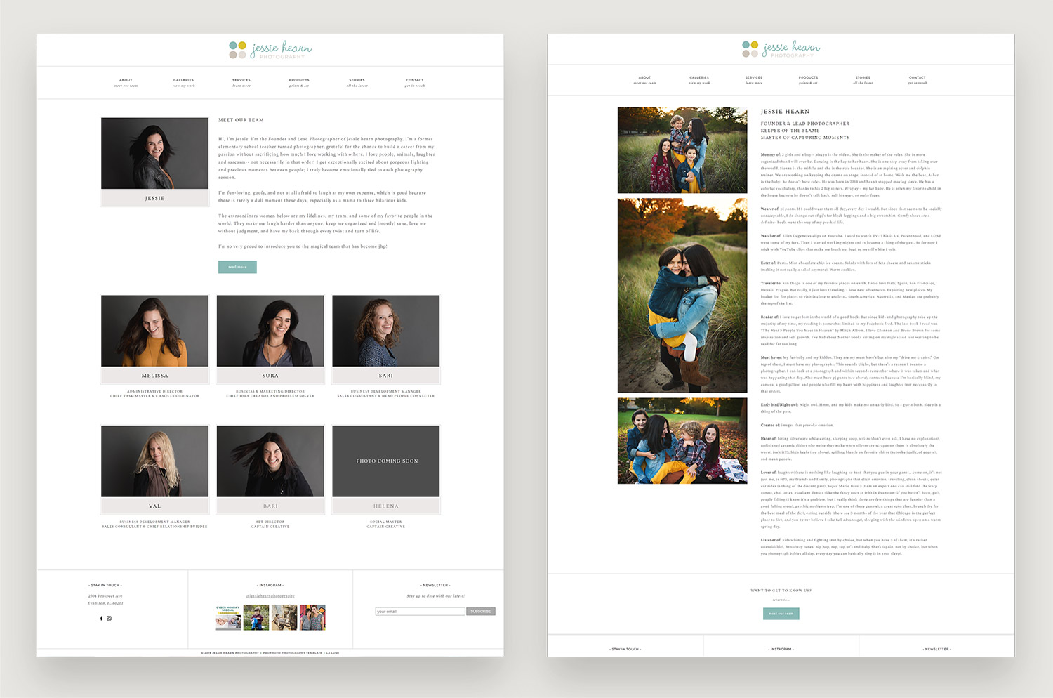
We just launched a website for Jessie Hearn Photography! Jessie found this Pro Photo 7 template and then realized it would be best to collaborate with a designer to get it exactly how she envisioned. We worked together to decide what pages to add on, and collaborated to create these new layouts for the site. We also setup the base template, content, and tweaked it for her brand.
For the Meet the Team section, Jessie took these great studio portraits of each of them. These really showcase personality, and they bring a cohesive feel to the page. Each person is then linked to her own bio page, with all these little tidbits showing who they are: “listener of, mommy of, wearer of, watcher of”… I just love how much thought went into this on Jessie’s side. I brought it all together visually and made it easy for someone to want to read.
Next we worked on Services. Jessie runs a busy studio and wanted all her pricing details on the site for clients to see upfront. Normally, I’m a believer in less is more and I wouldn’t create such a long page with so much information, but this works for this business. Our challenge was to find a way to make it easy for the viewer to use. We created a menu on top and visual menu links as well. These navigate to each section of the page so you don’t have to scroll through all the information if you know you want product photography, or headshots. We also wanted to make sure the text was broken up to be easily readable and visually interesting. There are easy call to actions near each section as well so the client can book the session or view the gallery.
And finally, the home page. The home page stayed pretty true to the original template. I tweaked it to look better on mobile and changed some colors, but it fit Jessie’s brand pretty close from the start.
Looking to refresh your brand and create a new website in 2020? Send us a note.

