A new SquareSpace website for Windsor Films, a Maryland filmmaker
I’m so excited to share this recent project for Maryland filmmaker, Mitch, owner of Windsor Films. Since one of the beautiful parts of this website is the motion involved, I created a short video walkthrough.
Mitch wanted a website that was clean in style, well organized, and looked great on all devices. We wanted to emphasize an upscale brand, but one that is still very approachable. Mitch is friendly, and easy to be around. We wanted to the website to represent this.
While Windsor Films specializes in wedding videography, he is now offering family video as well. We created a landing page to show this new segment of Windsor Films. This is an all-in-one page with information, videos, and a contact form. It’s one of my favorite parts of the website.
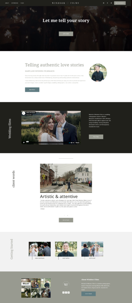
The homepage shown here starts a short video behind the header, and button to get in touch. Some people are coming to the site for the second or third time, and are ready to connect, so this gives an easy way.
Next we have a little get to know you section about Mitch, and a link to learn more.
Below that, we have a featured film, that Mitch can easily change out, when he’s ready to show new work. Following is a scrollable client words section, that can be added to, or replaced with new testimonials.
Then we have our Getting Started section, which is a way for viewers to be guided through the steps of working together: view films, meet mitch, and booking a call.
The footer integrates Instagram, and has all the places to connect on social media.
All our projects start with pre-project planning, questionnaires, a strategy session, and then a week diving into inspiration and concepts. I always like to look back at the mood board created during this first week.
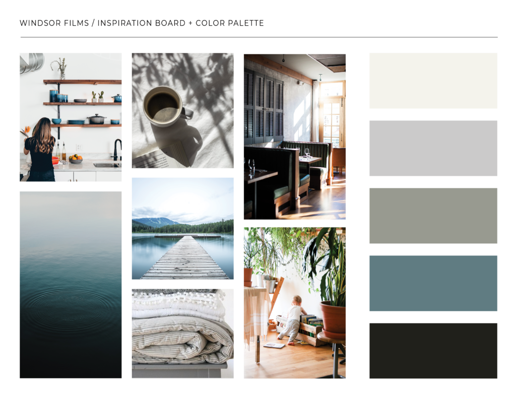
The images are just for inspiration, and to capture a vibe. The color palette is something we lock in during this phase, but we do sometimes add to it, typically just a darker or lighter variant of what we originally envisioned.
Next we chose font pairings, and created a mockup in Adobe XD. In this case, our website turned out so similar to the mockup, that I don’t see a need to share it. Many times, the mockup is more of a starting point, to make sure we have the right style and elements included in our design.
After Windsor Films approved this first phase, we evaluated whether which would be the best platform for his website, Squarespace verse WordPress. I’m a WordPress geek, but in this case Squarespace offered more of what we were looking for, an incredible integration of video being the most important feature.
Everything above sounds like a lot but it typically takes a week to 10 days. It is an essential very important part of the process. (I’ve skipped it on my own site redesigns for Jessie Mary & Co. and certainly won’t every again!)
Once we selected SquareSpace, we created the header, footer and homepage. We always stop here and get approval before moving on. After this step, the style is really locked in and we can move onto designing the About, Portfolio, Services or other interior pages.
Once the site is designed, we’re not done. We create tutorials, do final quality control checks to make sure nothing was missed, and add our “light seo” to the website.
It’s definitely a collaborative process!
It’s been a pleasure to work on this project, and to get to know Mitch. He’s an amazing filmmaker, so definitely check out his work at www.windsorfilms.net.
If you’re interested in having your website redesigned for 2023, book a consult.

