What to include on your website footer
I think footers are often overlooked.
Some times a website will be beautiful designed and then the footer will loose continuity. Other times, it will look pretty and cohesive with the website design, but will not have strategic content.
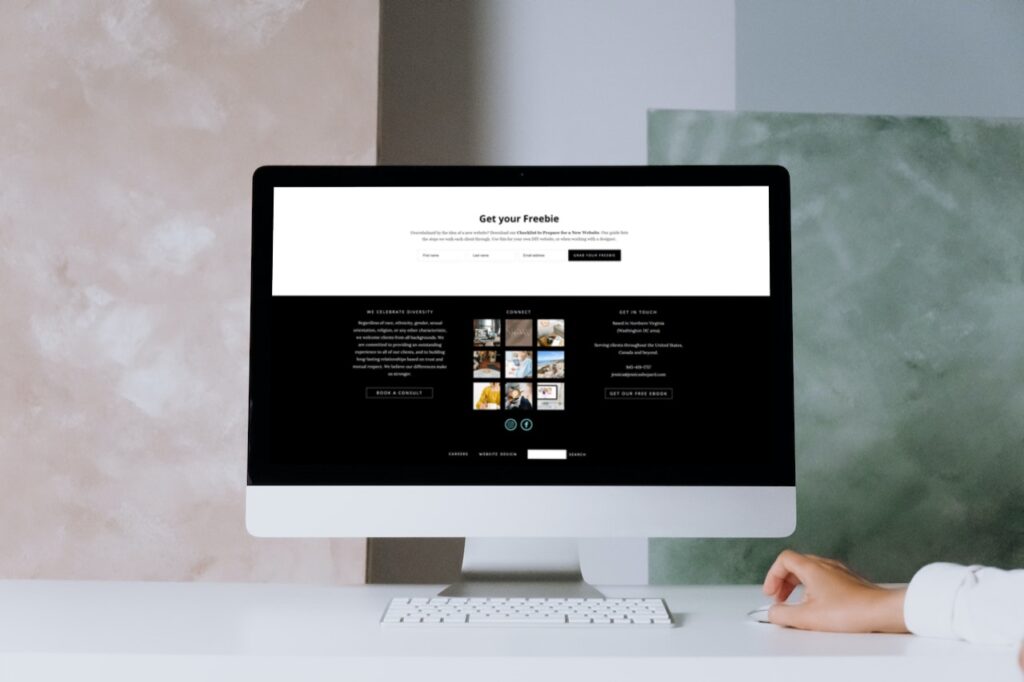
The footer on my website here is probably my favorite part of the whole site. It has useful information that I want to highlight, quick links to nav, recent Instagram photos, our diversity statement and information on how to connect, including both social, email lists, and contacting directly.

Not every website is going to need the same things on the footer, but there are some that are always useful to include.
How to reach you or find your business
If you are a local business, this should include your town or areas served. For most businesses this should also have a phone number and a link to your contact form, or email address. If you have a physical location that customers come to, then your exact address should be added.
A summary of what you do
I recently removed this section from my website because I wanted the space for our diversity statement. In most cases, however, I recommend having a short blurb repeated here, since it’s shown throughout your website and can help with SEO. This should be simple and to the point.
Here’s an example. “Jessie Mary & Co. is a small web design business specializing in working with creative women, and photographers. Serving clients throughout the United States and Canada.”
Menu or quick links
Not everyone needs a secondary menu on the footer, but if your top menu is complex or you have inner pages that you want to highlight, then it can be a good place. It’s also a great way to emphasize important areas one more time, using quick links to a portfolio, or services page.
Instagram feed or your logo
This is the designer in me here, but I like something that catches the eye on the footer. It can be your logo, or you can incorporate in your Instagram feed. Only add your IG feed if it’s 90% of the time relative to your business. If you post a lot of personal photos that aren’t of great quality, then I would use a “mock feed” that links to your Instagram account but is really a gallery on your website. This controls the looks and keeps the footer brand cohesive.
Social media icons
This goes back to how to find you. It gives views another way to connect with you when they are not quite ready to use the contact form. Only include social channels that you are active on.
Newsletter signup with freebie
The footer can be another chance to incentive viewers to sign up for your email list. I always recommend having a free download or other offer to get people to hand over their email address. This is another way you can connect with those that aren’t quite ready to book a call, or get in touch directly.
I’ve included more ideas than will fit well on most footers. You can pick and choose which works best for your business, and fits in with your branding / website design.
Looking for a new website or a refresh? We are accepting new clients. Book a call to learn more.


