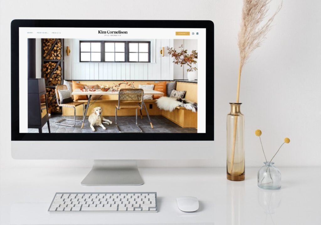
What does your website look like on your phone?
As someone that has been in business for a while, I can see how it can be easy to think of your website as something people view on a computer. While even 5 years ago, primarily viewers did visit sites on their computers, now more viewers will at least go to your website for the first time on their phone or tablet.
Number of mobile viewers
You can use Google Analytics to see the number of mobile viewers verse desktop. For us, it’s 55% of viewers are on mobile. This is likely lower than some businesses since we serve other business owners, who are likely to be sitting at their desk with a computer for work already. If you serve people that are not business owners, this number of mobile viewers will certainly be higher.
It’s totally fine, if you don’t want to check. It’s safe to assume it’s more than half, so you definitely need to priority how your website looks on mobile.

It will look different and that is okay
When thinking about mobile views keep in mind the key phrase is responsive. This means a website is meant to adapt to look different on each screen for the best experience on that type of device. Above is my website on a large screen and a phone. This are unmanipulated screenshots (just put into a Canva template because I’m a designer and can’t resist it looking good).
Some times I have clients that expect a website to look exactly the same no matter what device it is looked at on. I always proof websites on Firefox and Chrome on my pc, Safari on my Macbook, my iPhone and my iPad. It looks different on each device, but the goal is for it to look great and be functional on each screen.
Designing with mobile devices in mind
A few years back, best practice was still to design for desktop screens and then to tweak for mobile. I now design with mobile in mind as well as computers. I go back and forth in views while I create a website. Then at completion, I do a final proofing on each type of screen, and adjust as needed.
How does your website look on mobile?
Take 15 minutes and view your website on your phone.
See if it functions.
Check the menu. Click on all of your links on both the menu and within your pages. Make sure you can read the text easily throughout the site. Is it easy to navigate through and see everything that will keep a potential client looking?
Consider the look
If your website functions on your phone, it’s time to think about if it looks good. Go through every page again and make sure it’s visually appealing. This is a little more subjective, but ideally it should be just as powerful of a marketing tool on mobile as it is on a computer.
Going back to my website… If I were to grade my site, I’d give it a B+ for the look on desktop and a C+ on mobile, so less than ideal but passable. This is because my site was designed 5+ years ago and tweaked with new content and images over the years. (It’s due for an overhaul!). At that time, functioning and looking decent on mobile may have been enough, but it’s really not anymore.
Interested in talking about a new website? We are booking for early 2024. Book a call.


