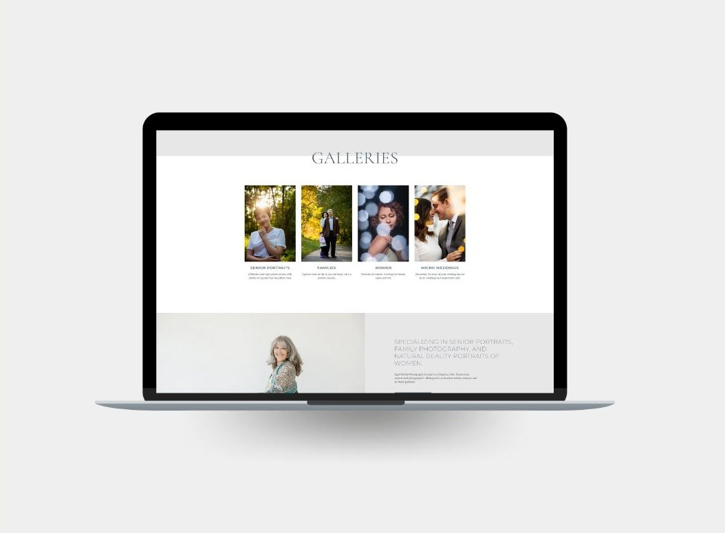
Senior and Beauty Portrait photographer, Light Bubble Photography gets a new look

Some times I talk to a client years before I work with them. I think Eunice and I first connected 4 or 5 years ago. We have a lot of the same colleagues, and ended up staying in touch on social media. When Eunice was ready to rebrand her photography business, it felt like I already knew her. I absolutely love the connection aspect of my business… all the amazing small business owners I get to meet.
Eunice’s old website no longer reflected her style or even the type of work she offers. Along with the new website, Eunice renamed her business and truly relaunched her brand.
The new website focuses on her specialties of senior portraits and beauty photography of women. When we first spoke about this project Eunice told me that she was wanted to solely market to senior boys. As I followed along with her work on Instagram while we were in our planning phase, I asked her about all the amazing images she takes of women. She told me these women are often the moms of the senior boys, or other professional colleagues.
We talked a lot about this idea of also incorporating this type of beauty photography into her website. I could see her passion for it, so I admit to nudging her a bit. I’m so glad she decided to run with it, as it’s my favorite part. Maybe it’s that I’m a mom to a teenager too and know how seldem we focus on ourselves and get in the photos.
My clients that are photographers often ask me if they should have one site or need multiple, one for each specialty. While it’s a complicated question, the first thing to consider is if you are marketing to the same person for all the types of photography. If you are a commercial and wedding photographer, then likely the answer is yes, you should have two websites. Here though, Eunice is targeting the same people, since it’s typically women hiring her for the senior portraits of their children, so it works well having one website.
We migrated Eunice from an older website to a WordPress with Elementor framework. After going through Brand Assignments (lots of surveys) and our Strategy Call, we came up with a direction for the website and designed a mockup of the home page. Once we had the style down, we designed fully custom homepage to set Light Bubble’s brand apart.
Here’s a short video of the new website.
If you’re looking to redesign your website, or create a new website, next year, we still have openings. Send us a note for more information.


