Pro Photo Sites review from a website designers perspective
Scroll down to see my recent thoughts after using Pro Photo 7 for over a year on an almost daily basis.
I’m really excited to share my Pro Photo 7 review! This new version was just released a couple weeks ago but I’ve been beta testing it since winter.
As many of you already know, Pro Photo 6 was a major overhaul to this long standing theme for photographers. While a good product, it had one challenge… ease of use from the backend. It allowed us to create beautiful responsive websites but learning it took some time. You can read my review of Pro Photo 6 if you want the back story to this new release.
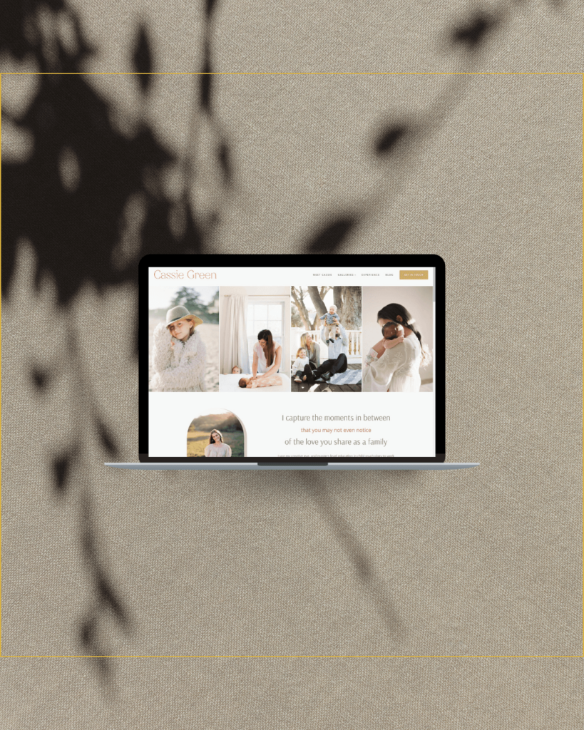
Below is a teaser preview of the Pro Photo 7 custom designed website that we are launching later this week!
first thoughts
First, the new tagline is awesome…
infinite possibilities
It really does sum it up. This is a theme that can do it all. I’ve even caught this little voice in mind recently saying “should I use Pro Photo?” when I was working with a business client. More than 75% of my clients are photographers and 95% of them use Pro Photo. The rest of my clients are small business owners and I normally use a framework called Genesis. This new version though can be used for any type of website, for photographers, creatives and more.
It can look sleek and modern, minimalist, feminine or bold. You can create a one page site, a modern scrolling style or a traditional feel. Pro Photo 7 is really what you want it to be.
what’s new in Pro Photo 7?
Exactly what needed to be.
If I was to look at a website I could not distinguish between version 6 and the new Pro Photo 7. The backend has completely changed. Honestly, it threw me for a loop at first because as a designer who uses it day in and day out, I developed an in depth understanding of v6. It’s a very different infrastructure when designing and took a little bit of getting used to.
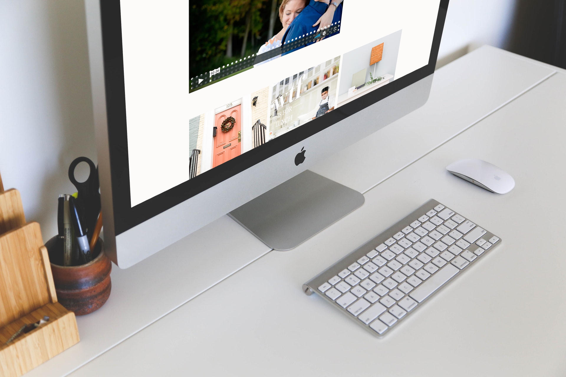
The backend is completely new. We’ve gone from working on the back side of the site to making edits while actually viewing the site. You can click on part of your website and make the change right there. No more going into a special view with rows and columns. I think this change will help new users adapt much more quickly whether upgrading from version 5 or 6.
Here is a really quick video showing the design view.
Should I upgrade?
If you are on Pro Photo 5 or older, absolutely! Keep in mind there is no upgrade path as far as your design goes though. You’ll have to start new, but you keep all your content such as your blog posts, galleries, about page, ect. You absolutely need to have a responsive website these days and the mobile friendly look of v5 is dated. Just be prepared to invest some time into learning Pro Photo 7, or hire a designer (send me a note) to get it setup for you.
If you have a Pro Photo 6 website that you like and don’t need to make any changes to at the moment, I’d hold off. The new version doesn’t add anything to what the site looks like. I haven’t found any new features yet, so if you’ve got an awesome template or custom design in pp6, leave it for now.
Have version 6 and you are struggling to figure it out? Upgrade. Version 7 is definitely simpler to figure out. I would not invest more time into building a site with 6 when 7 is available.

Changing from Pro Photo 6 to Pro Photo 7
I was just wrapping up a custom design project when v7 came out. I spoke with my client and we decided to go ahead with migrating the site. Unlike from version 5, there is an upgrade path. Designs can be imported from v6 to v7.
Keep in mind, that though it may not look like a big change, from a development standpoint, is a big change. It’s dramatically different in how it works and how you use it to create your site. Considering this, I’m just excited that designs can be upgraded.
I do have to admit it wasn’t flawless. It was simple to do as far as the actual upgrade but things were a bit wonky, and I’ve gone back and forth with support quite often over the last two weeks to get this site migrated. It was little things but little things can drive you bonkers in website design if you are detail oriented.
During this process, Pro Photo has rolled out many updates to v7 though and fixed issues, so my guess is my next design migration will be much easier. This is why I say not yet if you are happy with your Pro Photo 6 site. Give it a few weeks or a month, and I’m guessing the migration process will be seamless.

Do I recommend pro photo 7?
Yes, I absolutely recommend it.
It’s an amazing theme, with an awesome support team behind it. The support is the reason I work with this theme daily. I know they are there if I have issues during the custom design process, but more so I know they are there for my clients later.
I think I’m actually starting to I like it. Liking software and recommending it are two different things. I was excited to beta test because I like to play with new technology. However, I was actually not excited it was being released so soon because it meant changes to my daily work flow that I have perfected. Right now I’m going back and forth between 6 and 7 depending on the project I’m working on. The more hours I put into Pro Photo 7, the more I am feeling like it’s starting to jive and am enjoying using it.
If you’d like to buy Pro Photo, here is my affilliate link. Please note, I only sign up for affiliate links for products I truly believe it.
Want to create an incredible custom design for Pro Photo 7 or need help with personalizing a template? I’m now accepting Pro Photo 7 clients, and have two openings left this summer! Send me a note for all the details about working together.
Updating April 2019
After using Pro Photo 7 for over a year, I absolutely recommend it and recently changed this website over to it. I’m normally a die hard fan of Studiopress and Genesis for my own website, so this say a lot.
If you are using Pro Photo 6, I do now recommend updating to version 7. The transition has become much easier, requiring less tweaks in the designs each time I do a migration. I did 3 migrations last week and they all went very well and quickly. Mostly, it will save you time. Whether you do your website updates yourself or pay someone, working in Pro Photo 7 is quicker. It also makes customizing for different devices so much easier. While p6 can do the same things with mobile, I find you end up with a better mobile experience with 7 because tweaking it just right is much easier to do, and therefore more accurate in obtaining the look you want.
If you are using an older version of Pro Photo, I still strongly recommend the upgrade. Comparing it to Square or ShowIt? That gets trickier. For me, I’m a WordPress geek so will always recommend staying on WordPress before one of these other platforms. ShowIt does incorporate WordPress but it is not in it’s native form like Pro Photo. I do like ShowIt (see previous post ShowIt Website Design) but I still recommend WordPress + Pro Photo first.
Visit Case Studies to see examples of recent Pro Photo 7 projects.

