Custom Website for Jennifer Armstrong

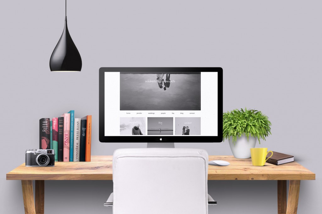
After working together for months, I’m so excited to announce Jennifer Armstrong’s new website. Jennifer is based outside of Vancouver Island in Canada, a place that looks to encapture everything I love about the Pacific Northwest. Seeing Jennifer’s gorgeous photos made me a little homesick for my years in Seattle and Portland. It’s not just the beautiful location though that makes her work incredible, it’s the moments she captures. While Jennifer is primarily a wedding photographer, her family photos are just as amazing, and if I do make it up that way, I’ll surely have to hire her to capture our family.
Jennifer decided to redo her website because her old one, a template through Folio Websites, was not passing Google’s mobile friendly tests. We kept a lot of the style from the original website. It was very important that the website was about the photos and minimalist. I want to describe it as quiet. The site just stays in the background, feeling to me like an overcast day in the northwest in late spring. Calm. In Seattle, when it’s May and you can suddenly see Mt. Rainier, magnificent and dominant in the sky, people say “the mountain is out”. I feel like that is how her photos stand out to the website. It’s the same feeling of this powerful image breaking through.
We started with the branding survey and inspiration board. The mood was very earthy in all of Jennifer’s pins. It consisted of lots of grays with a bit of green, lots of texture, and simplicity.
From this we came up with our color palette. We used the green very little, just as an accent.
It was really important to Jennifer to keep her original logo, so I simply helped her tweak the photography part on the bottom with a font that blended well with her website. Her name in the logo is her actual signature scanned in, so it is truly her, matching the authenticity of her brand.
Jennifer’s original website was very narrow in width with small photos. I think the style suited her, and we both agreed we did not want to go too large. Definitely nothing full screen would work. She stated that photos should look like photographs on a page… love this idea. As much of a tech geek as I am, I still adore old school photo albums. Below is a screenshot of the old website.
You’ll see on the new below that we still kept a similar feel… just added a bit more of Jennifer’s personality. She is direct, personable, and warm. We wanted this to show through.
The home page is a rotating slideshow with a message on each image. There is a very delicate texture as the background, that doesn’t quite come through on these screenshots. On the bottom, we linked to the most important areas of the website. Most photographers choose galleries as the most important, but Jennifer’s blog tells stories, so we both agreed this had to be featured. I like that the order itself guides the viewer through. Meet Jennifer, see her photo stories on the blog, and then send her a note to book your session or wedding.
For the about and faqs pages, we moved the buttons to the sidebar. Often these are less inspired pages on a website, but I really like how these two turned out. The faq has so much information, so we made the answers collapse and expand, to keep the layout clean.
You can visit Jennifer’s website to see more at www.jenniferarmstrongphotography.com.
If you are a photographer or small business looking to start or redesign your website, I’m currently accepting new clients. Simply send me note, and we’ll go over all the details.


