Custom ProPhoto Design for Angel Kidwell

I met Angel Kidwell at brunch in Bethesda almost 5 years ago. I had just moved to Virginia, and was doing some networking with other creatives. Only 4 of us showed up, and Angel was one of them. She was a new to professional photography at the time, and we instantly clicked (sorry for the pun!).
Over the years, we’ve become close friends. She’s supported me through personal hardships, listened to me ramble business ideas, and we’ve photographed many weddings side by side. Over lunch last year Angel asked me if I’d feel comfortable taking her on as a client, considering we were friends. I was honored and excited to work with her.
I said it to her, and I’ll admit it here. It was damn difficult working on a friend’s website! I always have clarity in seeing my client’s vision, but with Angel it was more like I was trying to design for myself. That said, I love a challenge and it was so fun to get to rebrand her business!
Angel is in many ways my opposite. She’s a bit girly and sparkly. She drives a fast black car, a Dodge Charger I believe. I drive a practical silver Subaru (that I find super awesome). Angel sometimes has teal hair, just for fun. Mine is brown with silver “highlights”. It was a really interesting branding process working together!
(I love sharing this right after Jennifer Armstrong’s brand, as it could not be more different.)
Since I’ve known Angel, she has struggled with her website and brand. I hope she doesn’t mind me sharing this with the world since this insight is more of a friend than client one. I know Angel’s photography inside out since I’ve spent countless hours editing her work on weddings she shot for me. I’ve always been amazed by her skill and creativity. She’s always grabbed such unique perspectives and creates amazing artistic work, but I’ve never felt like she’s shown it off well.
Our goal became to create a website that was uniquely her, with a bit of spunk and glitter. An organized website where clients could easily find what they were looking for and she could show off her beautiful art. But Angel had a twist. I say it that way because we went back and forth a lot, more than I have with any other client. We just weren’t nailing it for a while in the mockups. When we sat down for another Skype meeting, we started talking more about this idea of leading and storytelling within the website.
Angel had put a lot of time into writing content and creating pages that were meant to lead from one to another, but she hadn’t figured out how to create that flow. Once we had that clear, the website came together. We emphasized flow from one section to the next, creating a fluid design.
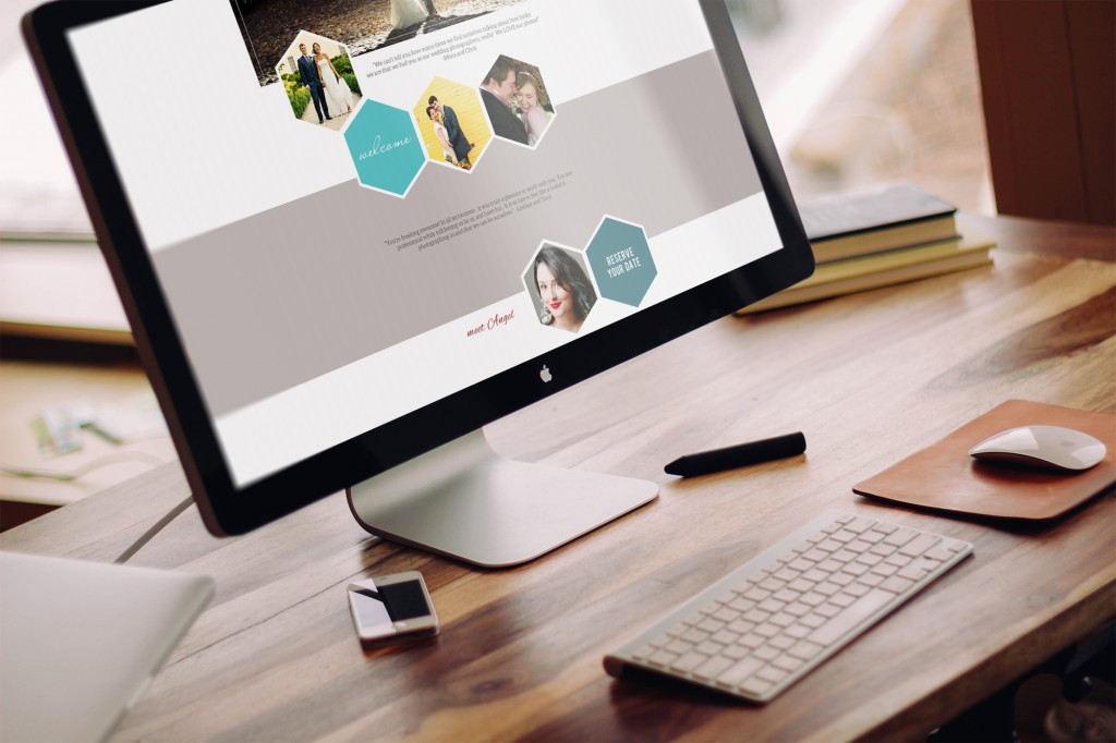
Let’s start with the colors: blues, teals and red! We wanted to be bold but to balance it to still feel professional. We talked a lot about red, especially considering Angel is generally appealing to a female audience, and the feeling it conveys. We decided a tiny bit of it as an accent would work well.
We incorporated some fun gold into the logo background and her watermark, as seen below in her blog post.
We also put together a pricing brochure to match Angel’s new brand.
One of my favorite pages is Angel’s about page. She wanted to show off a bit of her in a fun way, and setup a photo booth at home to capture silly self-portraits. It’s awesome to be willing to open yourself up on the internet instead of only showing a polished professional photo, and I think really embraces her personality!
On the home page, there are shapes that lead you to an area of the website. Each of these are roll-over buttons, with text added upon hover.
Thank you Angel for trusting me with you business!
If you are a photographer or small business looking to start or redesign your website, I’m currently accepting new clients. Simply send me note, and we’ll go over all the details.


