Brie Homer Photography | Pro Photo Website Design
Brie lives in small community in Northeast Pennsylvania, bordering on upstate New York. She has been in business for four years as a wedding and portrait photographer. (I just love her newborn photos!) When Brie and I first talked about her website, her main goal was to combine her Bludomain template website with her Pro Photo Blogs site.
Brie already had a logo, that she really liked and wanted to stick with. She, however, wanted to create a new feel for her online presence, standing out as a professional but still incorporating fun colors. I have known Brie casually through an online photographers group, but not very well. Once we spoke one on one, I just really liked her. I choose her as one of my first clients for a few reasons. The first was just that we clicked, but also that I understood where she was in business and felt a website redesign could really help her. Secondly, her design preferences were very different than mine, so I knew designing her website would be a challenge.

Brie’s website has ended up being one of my favorites. Here is a bit of what Brie had to say at the end of the design process.
I was blown away with all of the help and patience you showed me. Your design work is beautiful & beyond what I expected!
We started the design process with a Skype call, which ended up in a conversation about the old indoor amusement park with the ferry wheel coming out of the roof, in Asbury Park, New Jersey. It turns out we grew up an hour from each other. Mostly though, we talked about her business so I could gain a better understanding of her needs and her clients.
Here is the Pinterest board Brie created for me, to give me some ideas of things she liked and disliked. We also discussed different websites and aspects that she felt were good, or awful.
With all the information I gathered, I then went to work creating a mockup website design for Brie. I presented Brie with my idea, and she made a few small suggestions for changes. Then I implemented the design onto a test website. Once she approved the test site, we scheduled a day to go live.
With everything ready to go, I imported the design onto her domain. We chatted online back and forth through the morning, to make sure everything was right. Then we took down her bludomain site, and redirected it to her new blogsite. Within a few hours, her website was back up and running, with a new improved look and functionality. We still had a few things to take care of though.
Her original Pro Photo Blog was running on a subdomain, blog.briehomerphotography.com, instead of simply www.briehomerphotography.com. We also decided to change webhosts, which meant backing up all her data and moving it to the new servers. Her blog runs on WordPress, which is a database so a migration tool has to be used to keep the database in tact during the move. Most website hosting services can walk you through this process but it can get complicated, so generally I do recommend having a professional or at least a geeky tech-savvy friend do this.
Brie also uses Machforms and Photocart. Machforms is a plugin for WordPress that can create contact forms and way more. Its back-end is a database. I use Gravity forms for my websites, which is similar. Photocart is a proofing system that is also a database, and is used to display a photographers’ client galleries. Both Photocart and Machforms needed to be moved to the new web servers.
I had never touched either of these before and was upfront with Brie about this. She had confidence and still trusted me to take care of this transition. I want to add here that I wouldn’t have taken a chance if I felt it was risky to her website or business. When I used to work in Information Technology, one of the things I specialized in was being handed a software that no one knew what to do with. I would research it until I thoroughly understood it, often have to upgrade it, and then train other people on how to use it. In short, I felt very comfortable with my abilities, and excited to master something new. It took a few conversations with the companies that make these products, but in the end we got both transferred over and working successfully, along with her new website.
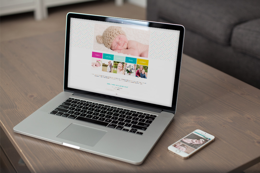
Finally, here is the before and after. Upon arriving on Brie’s old website, you were greeted with a splash page. Then you had a choice of visiting her website or blog. Though I prefer an all-in-one blogsite, this setup can work, and does for many photographers. To me, it means that as the photographer and business owner, you are having to spend more time keeping both updated, and I believe that for the best search engine rankings having it all together in a CMS (content management system) like WordPress is best. Enough geeky talk and onto the photos. Less than three weeks later, Brie Homer Photography had a new look, still retaining her identity with her logo and a similar color scheme. The new website design gives a clean modern feel, with the professional look Brie was looking for.
Look for a follow-up post next week, where I talk more about her new website design and the different aspects of the blog, galleries and more.


