Newborn Photography Website with a Warm Luxurious Feel
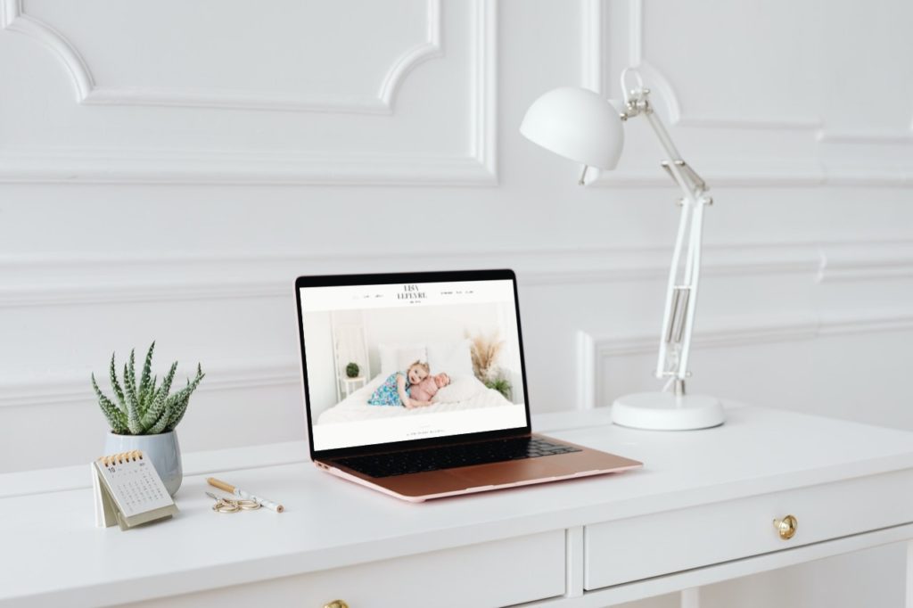
We just launched this newborn photography website for Lisa Leferve Photography! Lisa reached out right before moving to Atlanta. She was in the midst of relocating her studio, and her family. To go with the new location, we created a brand new look for her website.
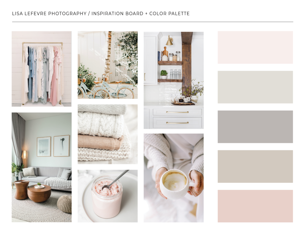
We created this soft luxurious color palette. Lisa’s brand is upscale, warm and inviting. She photographs newborns and maternity portraits, almost exclusively, so our goal was to represent that precious baby feel but in a modern way.
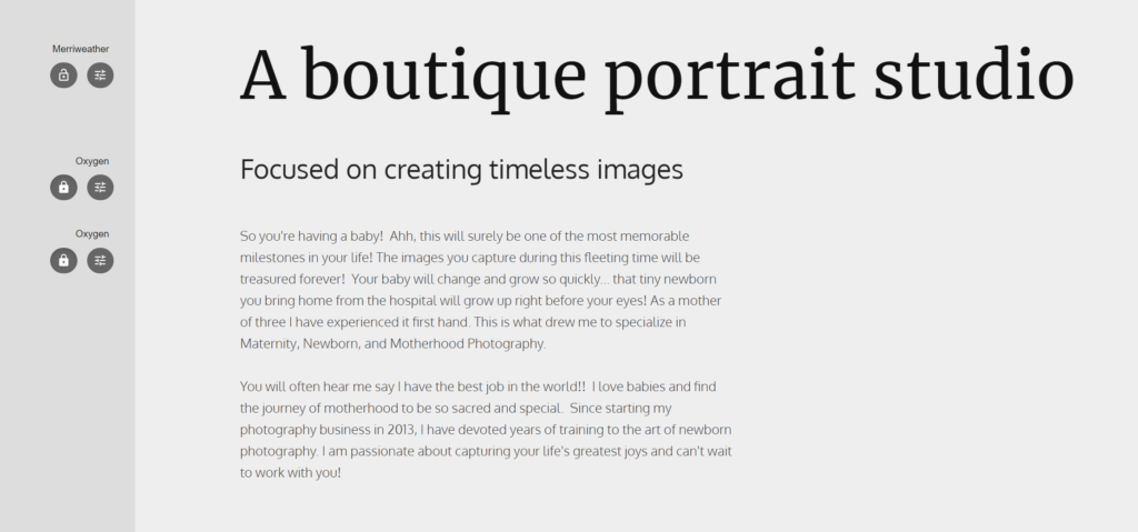
Next we choose typography. Lisa already had a logo. In this case, we always consider the fonts used in the logo when deciding on what to choose for the website. We choose Oxygen and Merriweather.
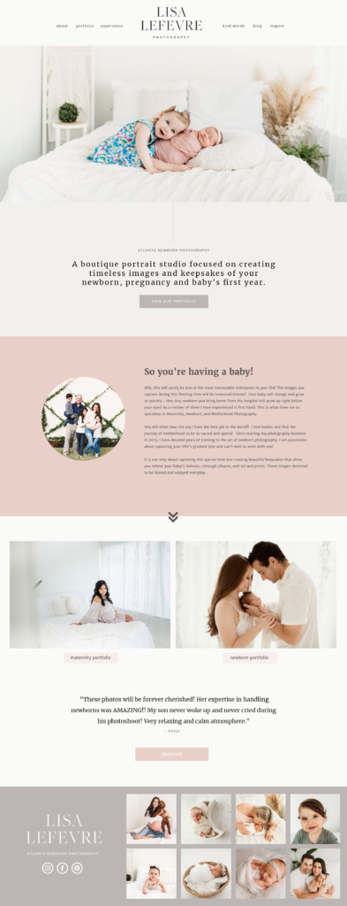
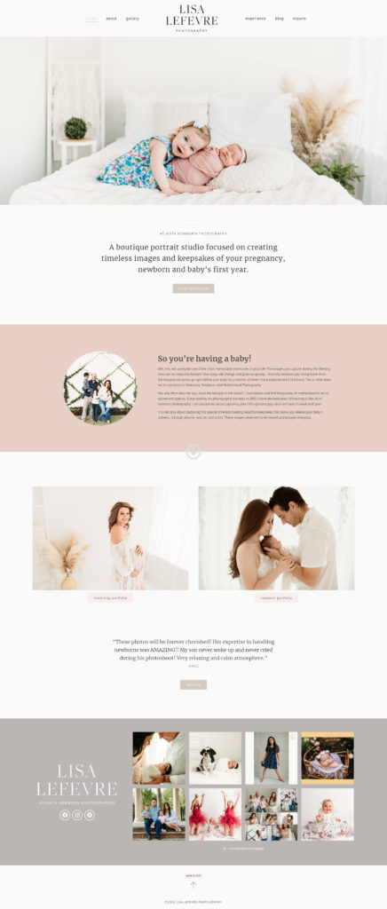
After we have the branding finalized with our clients, we move to creating a mockup of the website. These aren’t meant to be the exact site, but just a feel for the style and vibe. In this case, it ended up being pretty close to our final design. The mockup design is on the left, and a screenshot of the actual website is on the right. You’ll notice some spacing changes, color shifts, different fonts used in different places. To me the actual website feels just that little bit cleaner and more elegant.
I prefer to focus on design and marketing, but I want to include a little about the backend of this website today. This is a WordPress website, using the Hello theme and Elementor Pro. This combination is a blank slate as far as design goes. Anything we think of is possible, and it’s very simple to learn how to do basic edits for my clients (changing photos, or updating text). There are many reasons for choosing different platforms, that I won’t get into on this post. We always start projects by understanding our client’s goals and choose together what the best type of website is.
If you’re looking for a new website or some changes made to your existing one, we are accepting new clients for late summer 2022. Just book a 15 minute call and we’ll see how we can work together.

