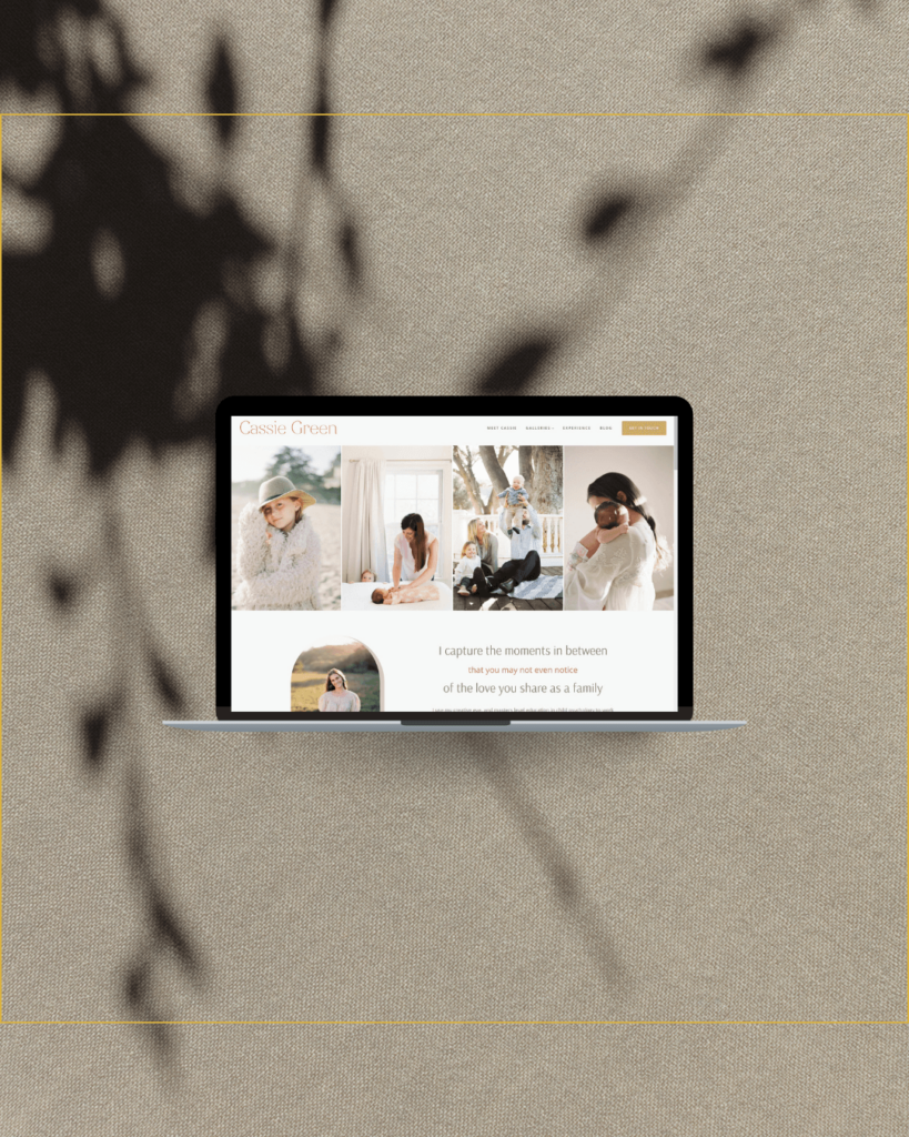
Squarespace Review, our thoughts on the updated website builder
I’ve experimented with Squarespace for many years. About 4 years ago, I started offering Squarespace design for select clients, when there was truly a reason to use the platform. Most often this was if they needed a small shop included in their website. Spacespace has made selling easy for a long time.
I’ve watched the changes Squarespace has made carefully for the last year or two, and the latest updates are impressive. Here’s their teaser video.
While I disagree with their statement “design anything without knowing how to design”, it is really true that you can do anything that you can envision.
I’ve often had clients tell me they avoid Squarespace because all the websites look alike. I do agree that this was true, due to the limited options of layouts for the different sections. Some Squarespace designers found ways to get around the rules by creating graphics in Photoshop or Canva, and using custom code. While a little custom code is fine, I avoid doing this too much because it makes it difficult for my clients to maintain their websites.
With the new Squarespace Fluid Engine all the constraints break free.
You can truly put anything anywhere. The freedom makes me think of ShowIt websites (though it’s not quite as powerful). While as a designer, I am super excited about it, I think for many DIY business owners, it may be a bit too much. The great thing though is the templates are still there. You can custom design one block and use a premade block for the next section down on the page.
Can it do everything WordPress can?
No, but it’s impressive and it can do things WordPress can’t do easily. WordPress can do anything for a power user, but there are many places where I think Squarespace would be the better choice. Shops, communities, and courses are some of the things I’d definitely go to Squarespace for. I also like it for someone that really wants to be hands off, to just create a website and let it be.
Most of the time, I’ll still go to WordPress but this change is certainly going to up the percentage of when I suggest to a client that we use Squarespace for their website design. We recently completed a wedding filmmaker’s website using it, and I’m quite excited to design with it again.
Do I recommend Squarespace?
Absolutely. The only time I would not recommend it is for those that blog regularly. You can blog in Squarespace but WordPress is the superior tool for bloggers. If you are just starting out and designing your website yourself, Squarespace has been great for a long time. With the new changes, it gives designers the freedom to be able to create a custom design. One thing I really love about it, is the way it handles movement within the website. This can absolutely be done in WordPress too, but Squarespace makes it simpler to look good.
Overall, I recommend it for a DIY website and then it would be on a case by case basis for those working with me, or any web designer. I don’t think WordPress v Squarespace is a better or worse thing. Each one has a time and business / brand that it is right for.
When I work with clients, I always encourage them not to get caught up in the platform we choose for a website until we deep dive into their brand. I definitely encourage you to think about your goals before you even start to think about how to design your website.


